
Stylizer Help
Bullseye provides a real-time display of the CSS that affects an HTML element that you click on. Press space bar to activate Bullseye, or click the Bullseye button on the right side of the address bar. You can also press Ctrl+Space (⌘-Space on Mac) to activate Bullseye when the Code Grid is in Edit Mode and space bar is not otherwise available. Pressing the hotkey or clicking the Bullseye button a second time will deactivate Bullseye.
When Bullseye is activated, moving your mouse across the web page will highlight the target HTML element beneath it. The highlight is shaded with up to four different colors, each representing an area of the element's box model: blue represents its content box, green covers its padding, yellow covers its border, and brown covers its margin.
When the element you would like to style is highlighted, click to display the list of CSS rules which match it. The list of rules appears at the bottom of the browser. The rules in this list are sorted by precedence—the order in which the browser has applied them. Rules at the bottom of the list have higher precedence than rules above them, and the declarations in these rules will usually override declarations in rules above.
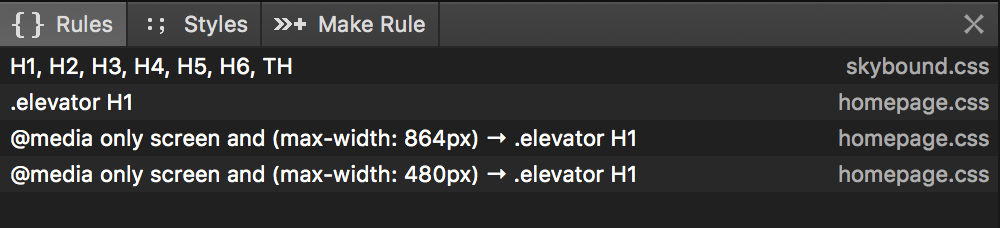
Click any of the CSS rules in the list to jump to it in the style sheet pane. The rule will be selected and focused so you can start editing right away.
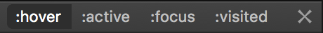
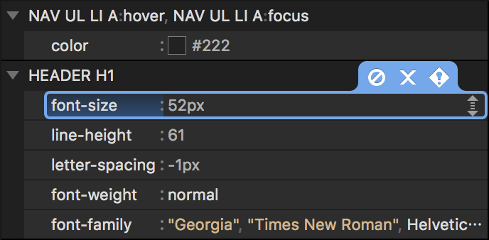
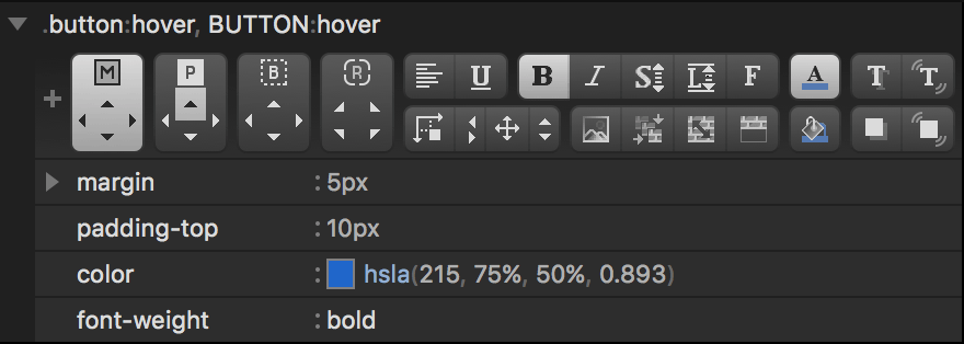
Rules that target the element you clicked and contain any of the dynamic state pseudo-classes :hover, :active, :focus, :link or :visited are always displayed in the results list, even when they are currently inactive according to the browser.
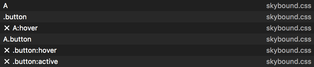
Notice that an X indicator appears before all inactive rules. This indicator updates in real-time as you type, click and move your mouse. For example, when a rule contains :hover, you will see the X indicator disappear and reappear when you move your mouse into or out of the target element.
The Styles tab organizes the declarations from all matching CSS rules into property groups. This view is usually more convenient when you have a particular property in mind but you are unsure of which matching CSS rules already declare it, if any.
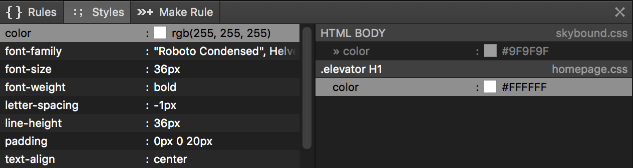
The list on the left displays the computed styles obtained from the web browser for the target element. Click a computed style to display the CSS declarations which influence it. Declarations are listed in order of precedence—again, the order in which the browser has applied them. Precedence is determined by the specificity of the rule which contains each declaration, the order in which the rules appear in the style sheet, and whether a declaration is marked as !important.
When you click a computed style, the declaration with the highest precedence is selected by default. Hold Alt (Option on Mac) when clicking to prevent automatic selection and maintain your editing position in the Code Grid. You may also double-click a declaration to start editing it immediately.
Inherited declarations—those which apply to a containing element and not the target directly—are displayed in a lighter color and prefixed with a guillemet arrow (»).
Many values in the computed styles list will be different from the CSS values in your style sheet. Computed styles are generated by the browser to represent its own internal state, and the CSS it generates is usually different (but equivalent) CSS compared to what we would write ourselves. Nevertheless, it is often helpful to see the browser's representation of a CSS declaration especially when something is unexpected.
Furthermore, the declaration list only includes CSS which has actually accepted by the web browser. For example, consider the following set of declarations:
-webkit-box-sizing: border-box;
-moz-box-sizing: border-box;
-ms-sizing: border-box;
When using Bullseye in a WebKit-based browser like Chrome or Safari, only the -webkit-box-sizing would be listed; in Firefox, only -moz-box-sizing would be listed; and in Internet Explorer only -ms-box-sizing would be listed.
An X indicator appears before all declarations contained by a rule which is inactive due to the state of its dynamic state pseudo-classes.
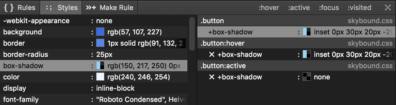
This indicator, as well as the computed styles, update in real-time. This allows you to observe, for example, the effect of moving your mouse into and out of an element styled by a rule that contains a :hover pseudo-class.
Inline styles are displayed in the declaration list as well. These styles come from <style type=text/css> tags and style="" attributes in the HTML source, or have been assigned by JavaScript.
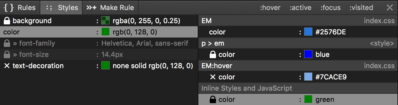
These styles are prefixed with a lock icon and cannot be edited within Stylizer itself. Inline styles are higher precedence than any CSS rule; to override them, you must mark a declaration as !important. An inline style itself marked with !important cannot be overridden in an external CSS file.
The declaration list displays on its right edge the name of the CSS file which contains each declaration. When the file name is <style>, the declaration has been embedded directly in the HTML (instead of an external CSS file). Double-click <style> declarations to display their style sheet in the DOM viewer.
When one or more rules includes a dynamic state pseudo-class, buttons appear in the top right corner of the Bullseye pane to override how the browser applies rules during the Bullseye session.
Click these buttons to force the browser to apply CSS rules to the target as though the pseudo-class were a match. This is useful to simulate the target element being in a particular state which would be difficult to style otherwise. Note that these buttons only alter the CSS rules that the browser applies; they do not actually simulate the mouse clicking a button, or the input focus changing, so some JavaScript-based effects may not appear as they normally would.
Back to topThe Breadcrumb bar appears below the browser while using Bullseye, displaying the ancestry of HTML elements which parent the element over which the mouse is positioned. Each button on the Breadcrumb represents a single ancestor element. After Bullseye is deactivated, you may then click a button on the Breadcrumb to display the Bullseye results list for the ancestor element it represents. Note that the Breadcrumb stays on-screen even if you cancel Bullseye without actually clicking a target.
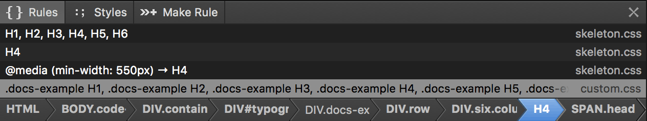
When you click on one of the Breadcrumb buttons, the element it represents is highlighted while the mouse remains over it. Breadcrumb buttons for elements which have at least one matching CSS rule are displayed in bold.
Each Breadcrumb button displays the HTML tag name, ID, and CSS class names of the element it represents.
For web pages with deep hierarchies, the entire ancestry may not fit into the available space, causing some of the information to be clipped. Click the Make Rule tab to display all ancestors, including their HTML tag name, ID, and all CSS class names, in a larger scrollable list.
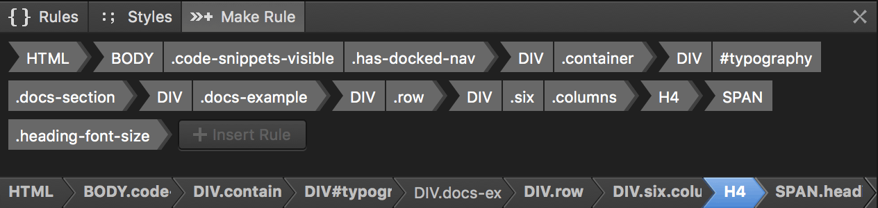
This list will stay onscreen during a Bullseye session, and updates in real-time just like the Breadcrumb bar does.
The larger list displayed in the Make Rule tab is also a tool to quickly create new CSS rules: build a selector by clicking the parts of the ancestry you would like to include, and then clicking Insert Rule.
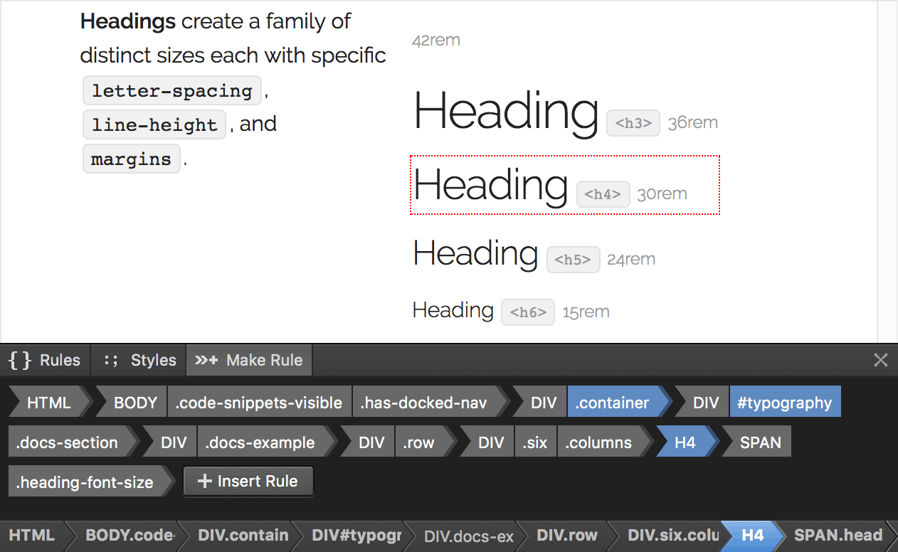
As you add parts to the selector, Stylizer displays a dotted red outline around the HTML elements on the web page which will likely be targeted by the new rule. Be aware that these dotted red outlines are only an optimistic guess; the actual HTML elements targeted by a rule depend on where the rule is ultimately inserted into the style sheet. For example, if the new rule is created within an @media rule, the targeted elements may be limited by the media query.
By default, the new rule is inserted below the selected rule in the active style sheet. An insertion bar is displayed on the style sheet when the mouse is positioned over the Insert Rule button, indicating the location where the rule will be inserted if the button is clicked. To insert the rule at another location, drag the Insert Rule button itself and drop it anywhere on the style sheet. The new rule will be selected and focused so you can start editing right away.
Back to topThe Elements Panel displays a real-time view of your HTML and linked style sheets as they appear to the browser. This is a live object hierarchy, which is often not identical to the HTML or CSS source used to initially produce it, especially if portions of the page have been altered by script after it has finished loading.
Open it by clicking Elements Panel in the drop-down browser menu button. If you find yourself using this feature often, work faster by adding it to the toolbar: right-click the drop-down browser menu button and click Toggle Elements Panel.
When you perform a Bullseye with the Elements Panel open, the element you click will immediately be selected in the tree. Likewise, when you click an element in the Elements Panel, it will be become the current Bullseye target.
Hover your mouse over an element in the Elements Panel to highlight it in the browser. HTML elements which contain text can be expanded in the Elements Panel to display their child text nodes. These nodes cannot be styled directly, nor can they become the Bullseye target, but they will still highlight when you hover your mouse over them.
Scroll an element into view by right-clicking it in the Elements Panel and choosing Scroll Into View.
Due to differences between browsers, the CSS you write almost never ends up being interpreted by the browser exactly as you wrote it. The Elements Panel can also display a live CSS DOM tree, which reveals which rules and declarations were accepted by the browser.
Display the CSS DOM by clicking Elements CSS Panel in the drop-down browser menu button. The style sheet that corresponds to the CSS file currently open in the Code Grid will appear. You may also click a <link> tag in the Elements Panel to open the CSS DOM for the style sheet it links. Note that the Elements CSS Panel menu item can only be used when one of the style sheets linked by the current page is displayed in the Code Grid.
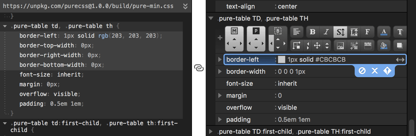
The CSS DOM tree is linked in real-time to the Code Grid, highlighting and updating as you work. In the screenshot above, notice how Stylizer has identified the top four declarations in the DOM rule (on the left) as being produced by the border-left declaration currently selected in the Code Grid (on the right).
When the CSS DOM tree is open, it will automatically follow the current selection in the Code Grid. Likewise, when you click a rule or declaration in the CSS DOM tree, the CSS source cell that produced it will be selected in the Code Grid. Right-click (or Control-click on Mac) a node in the CSS DOM tree to copy, expand, or collapse it.
Stylizer displays your CSS in the Code Grid, a highly productive editor designed specifically for CSS, that combines text editor flexibility with the productivity of a grid.
The Code Grid begins in Block Mode, in which whole rows are selected similar to a spread sheet. The most common ways to begin editing are to:
Enter to begin editing a new row below the selected cell, or Shift+Enter to begin editing a new row above the selected cell.Esc to enter Edit Mode and edit the currently selected cell.Once you have entered Edit Mode, type CSS much as you would in a traditional text editor. The Code Grid recognizes CSS punctuation characters as commands which which navigate and create cells, so the learning curve is minimal. For example:
@media query, press { to begin editing the first declaration or rule.: to jump to the property value cell.; to make a new declaration below the current one.} to create a new rule below the current rule.Press Ctrl+Down/Up (Option+Down/Up on Mac) to expand or collapse the current row. This works in both modes.
When you type CSS, the Code Grid saves you keystrokes by continually suggesting keywords and unit suffixes. These suggestions are displayed in a lighter color after the text you are typing. For example, m:a Enter will input a margin: auto; declaration into the Code Grid. Likewise, m:2 2 Enter will input margin: 2px 2px; into the Code Grid. There are several ways to complete with the suggested text:
Tab or Enter inserts the suggestion.; inserts the suggestion and a new line below (like pressing Enter twice).Space inserts the suggestion followed by a space., inserts the suggestion followed by a comma.Insert a new comment into the Code Grid by pressing /. In Edit Mode, press Ctrl+/ (⌘/ on Mac).
You may also disable CSS declarations or entire rules by converting them to a comment, or enable them by converting them back to code. To toggle the selected cells between being a comment and code, press F8 (or ⌘8 on Mac). There is also a button on the Context Bar to perform the same operation.
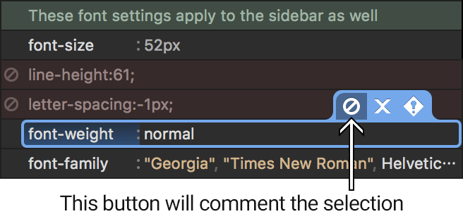
A comment that contains CSS code is displayed with a red background. This distinguishes code from explanitory comments, which are displayed with a green background instead.
When you comment out an entire rule, any nested comments within are parenthesized with (* *) instead so that the rule may be converted back to CSS at a later time. For example, the following CSS code:
div {
	/* set a default background color */
	background-color: black;
}
When commented out in Stylizer, becomes:
/*div {
	(* set a default background color *)
	background-color: black;
}*/
Size Grips are arrow icons displayed on the right side of the selected Code Grid cell for declarations which accept numeric values. To use a Size Grip, click and drag the mouse to adjust the value. When the mouse is positioned over a size grip, the mouse cursor changes to indicate the direction in which it must be dragged in order to adjust the value, and the cursor remains frozen in place while being dragged.
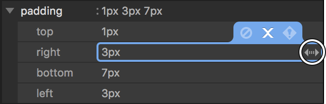
To adjust CSS properties which operate in a horizontal direction, such as width or letter-spacing, drag the mouse left or right. For properties which operate in a vertical direction, such as height or line-spacing, or properties which do not have a natural direction, such as animation-delay, drag the mouse up or down to adjust the value. Some CSS properties have both a horizontal and vertical component, such as background-position. For these properties, drag the mouse in all directions to adjust both components simultaneously.
When a CSS property supports layers—multiple value sets delimited by a comma, like background-position—the Size Grip will adjust the numeric values of the layer which contains the caret. For example, given the following declaration:
background-position: 1px 2px, 3px 4px, 5px 6pxWhen the caret is positioned within 1px 2px the Size Grip will adjust the first layer; when positioned between 3px 4px it will adjust the second layer, and so on.
Size grips can also be adjusted using the keyboard. Press Alt+Up/Down (⌘Up/Down on Mac) to decrement or increment a vertical Size Grip, or Alt+Left/Right (⌘Left/Right on Mac) to decrement or increment a horizontal Size Grip.
Reorder rows in the Code Grid using the hotkeys Ctrl+Shift+Up/Down (⌘⇧Up/Down on Mac). These hotkeys work in both Block Mode and Edit Mode, and will re-order the entire selection range if more than one row has been selected.
You can move a style rule into or out of the @media or @supports block above by pressing Tab or Shift+Tab. This is similar to pressing Tab to indent a line in a text editor. Note that in Edit Mode, the caret must be positioned at the very beginning of the line in order for this to work.
The selected rows may also be reordered by holding Ctrl (Command on Mac) and dragging them to a new location using the mouse. Hold Ctrl+Shift (Command+Shift on Mac) when dragging to duplicate the selection instead of moving it. You can even drag the selection outside of Stylizer and drop it directly into a text editor as CSS code.
In CSS, shorthand properties are used to declare the value of several properties at once. For example, the margin property specifies the values of the margin-top, margin-right, margin-bottom, and margin-left properties all at the same time.
Stylizer makes it easy to switch between shorthands and individual declarations. Press Ctrl+U (⌘U on Mac) to Merge individual declarations of the current rule into a single shorthand property. Conversely, you may press Ctrl+Shift+U (⌘⇧U on Mac) to Split the subproperties of the selected shorthand into individual declarations.
When you split a shorthand, only the subproperties which have non-empty values become declarations. For example:
font: 500 16pt Helvetica, Arial, sans-serif;Will split into the following set of declarations:
font-weight: 500;
font-size: 16pt;
font-family: Helvetica, Arial, sans-serif;
It is important to recognize that shorthand properties substitute the initial value for any subproperty whose value is not provided. In the first example above, the font shorthand is missing values for font-style, font-variant, font-stretch, and line-height, so these properties would be reset to their initial value. In the second example, because individual declarations are used instead, the missing properties would not be reset.
The thing to remember is that individual declarations are not semantically equivalent to a shorthand declaration unless all of the shorthand's subproperties are specified. And this is precisely the point—split a shorthand into individual declarations when you need to set certain subproperties without resetting others; merge when you must be sure all subproperties are reset.
Back to top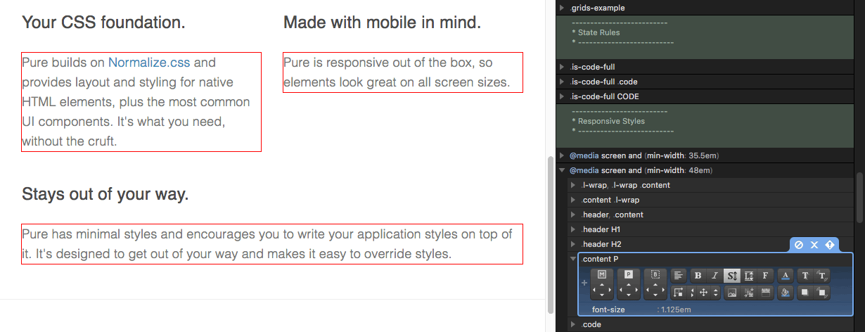
Press F9 (or ⌘9 on Mac) to display or hide Stakeout outlines.
The red outlines update immediately as you type. This can help when creating new rules, since it clearly identifies the elements which will be affected by the rule you are creating as you type the selector list.
When a rule containing a :hover or :active pseudo-class is selected, Stakeout additionally outlines all possible matching elements in a lighter shade of red.
Stakeout also helps when working with a responsive design. If the selected rule is contained within an @media rule, red outlines are displayed only when the style rule itself is being applied by the browser, and will appear and disappear in real-time as the browser window is resized.
When used in conjunction with Bullseye, Stakeout can help determine which rule in the list of Bullseye results you should edit in order to target the correct elements. Clicking a Bullseye result immediately selects the corresponding rule in the style sheet, and when Stakeout is on, this action in turn causes the HTML elements affected by the rule to be outlined in red. This allows you to quickly “click through” the results in order to determine the correct rule to edit—or determine that you need a new rule.
Stakeout also outlines the entire preview pane of each browser to which a media query applies when an @media rule is selected.
Rulers enable you to specify the maximum width to which a browser preview window will be resized. They allow you to work with a larger Stylizer window while ensuring that your page is being displayed at a specific width.

Click View→Rulers or press F6 (⌘6 on Mac) to show or hide Rulers.
Click anywhere on a Ruler to set the maximum width of the preview pane below it.
Rulers also help you to quickly switch between the most important widths of your design. These important widths are called preset widths and are displayed on the Ruler as left-pointing arrows. When you click near a preset width, the mouse will snap to it. When you hold the left mouse button and drag, the width does not snap, allowing you to choose widths that are close to a preset. You can also switch between preset widths by right-clicking on the Ruler and clicking one from the list.
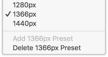
By default, Stylizer includes preset widths for the most common display sizes. To add your own preset, first resize the browser preview window to the width you would like to add, then right-click and choose Add Preset. To remove an existing preset, first left-click it, then right-click and choose Remove Preset.
You can also configure a Ruler to stretch the preview to the maximum available width by right-clicking and choosing Stretch To Available Width, or by simply dragging the width beyond the right edge of the Ruler.
Rulers display widths in CSS pixels, not physical pixels. A CSS pixel is a unit of measurement which depends on the DPI of your display, and can also be configured by the use of certain meta tags in your HTML code. CSS pixels correspond to the px CSS unit, and are the unit of measurement typically used by @media queries.
The difference is perhaps most noticable on a Windows PC with a non-default DPI setting (“Large Fonts”). Given a setting of 120 DPI (125% of the 96 DPI default), each CSS pixel would be 1.25 physical pixels. In practice, it's not possible to display a fraction of a pixel, so in this setting every 4px of width would be represented by 5 phyiscal pixels. Therefore on the Ruler, each 100px increment would be 125 physical pixels wide.
The Remote Control is a convenient strip of buttons which appears above the declaration list inside each style rule. The buttons on the Remote Control each represent a single CSS property.
Click a button to insert to its corresponding CSS property, or right-click to delete the property. Some buttons are size-grips; you can click and drag to insert and adjust in a single action. And just like the Size Grips on the Code Grid itself, when the mouse is positioned over a size-grip button on the Remote Control, the cursor changes to indicate the direction it must be dragged to adjust.
The text-align, text-decoration, font-weight, and font-style buttons can be clicked repeatedly to cycle through their common values. The cursor will change to indicate when clicking one of these buttons will cycle the value.
A Remote Control button appears pressed to indicate that its corresponding property is declared somewhere in the current rule. You can always click a Remote Control button regardless of whether its property is declared or not and a new declaration will be inserted if necessary. Declarations are inserted at the end of the rule, or at the current line if it is blank.
The (+) button inserts a new empty line at the end of the rule. You can also drag and drop the (+) button to insert a line at another location. This can be used to easily create a property anywhere within the rule:
The first four buttons on the Remote Control are taller than the others. These buttons target the margin, padding, border, and border-radius shorthand properties. The arrows on these buttons target the subproperties of their shorthand, or the individual properties if they are declared individually.
For example, if the rule contains a margin-top and margin-bottom declaration, the arrows on the margin button will target these individual properties. If the rule contains a margin declaration, however, clicking the arrows on the margin button will cause the margin declaration to expand and adjust its subproperties instead. These buttons are designed so that you don't need to be concerned about which declarations are in the rule—to adjust the top margin, simply drag the top arrow on the margin button, and so forth.
This feature displays laser-like lines that follow your mouse cursor when it is over the browser pane, and a digital readout that measures the dimensions of an area of the page. Lasers are used in a three step process:
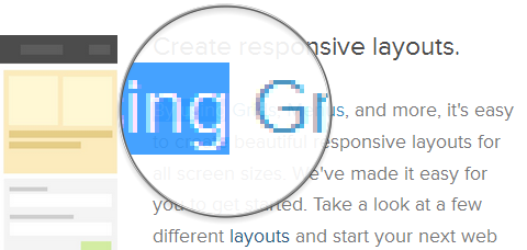
This feature displays a 8X zoom lens beneath your mouse cursor when it is over the browser pane. Like Lasers, the Lens is used in a three step process:
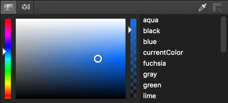
The default color picker has three inputs: a vertical bar to choose the hue, a 2-dimensional box to choose the saturation and luminance, and another vertical bar to choose the opacity (transparency). To enter or adjust a color, simply adjust these inputs.
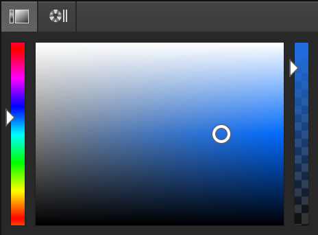
This color picker works best as a tool to select general colors that suit your design. The 2-dimensional surface lets you eyeball the new color without altering the hue, which often prevents a poor color from being chosen.
The color wheel makes it easy to choose complimentary colors. The inputs in this view provide more fine-grained control over the exact hue, saturation, and luminance than the traditional color picker. Display the color wheel by clicking the the second tab button on the bar above the Palette.
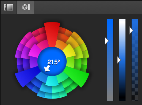
The color wheel helps you choose complimentary colors in the same way that the keys of a well-tuned piano play complimentary frequencies. Each wedge of the color wheel is a specific distance apart in the color spectrum: the large wedges are 120º apart, the wedges in inner and middle row are 30º apart, and the wedges in the outer row are 10º apart. Limiting yourself to the hue values suggested by the color wheel significantly reduces the likelihood of choosing conflicting colors, in the same way that the keys of a piano will not produce frequencies that sound out of tune.
You can also select a specific hue by moving your mouse over the center of the wheel, and then either rotating your mouse wheel (one “click” is one “degree”), or if you do not have a mouse wheel, by clicking and dragging the center like a Size Grip.
The large wedge at the top represents the primary hue; it is this value that determines the color of all other wedges. Select a new primary hue by right-clicking anywhere on the color wheel, including the well at the center.
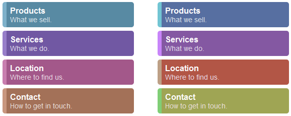
To demonstrate the importance of the hue value, here is an example of a menu where each item has the same hue value of 35º (left), and another where each item has a slightly different hue (right):
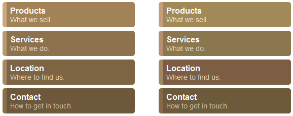
Choosing colors with an “RGB” based color picker often leads to the mess on the right. Use the color wheel to ensure that the hue of each color is equal and avoid this problem in your own designs.
Here is another example of a menu where the hue of each menu item is exactly 60º apart. The border on the left of each item is a lighter version of the background color (same hue).
The color of each item on the right was picked without taking the hue into account.
The Eye Dropper allows you to pick a color from anywhere on your screen and insert the color into the Code Grid. To open the Eye Dropper, click the Eye Dropper button on the right side of the Palette, or press Ctrl+E (⌘E on Mac). Then use the mouse to locate the color on the screen you would like to insert.
For fine-tuned selection, you can nudge the mouse one pixel up, down, left or right by pressing the arrow keys while the Eye Dropper is open.
The color under the mouse is copied from the screen and into the style sheet in real-time, providing an immediate preview. To close the Eye Dropper and keep the color, press Shift. To cancel, press Escape, and the declaration will revert to its original value.
Like the Eye Dropper, the Tape Measure allows you to measure the dimensions of an area on the screen and insert it into the Code Grid. To open the Tape Measure, click the Tape Measure button on the right side of the Palette, or press Ctrl+T (⌘T on Mac).
Use the mouse to locate the first edge of the object to measure. Press Shift to begin measuring, move the mouse to the opposite edge, and then press Shift again to insert the length into the style sheet. You may also press Escape to cancel.
Like Size Grips, the Tape Measure always operates in the natural direction of the CSS property being edited. For example, when the Tape Measure is used for a width or margin-left property it will always measure horizontally; when used for a height or margin-top property it will always measure vertically.
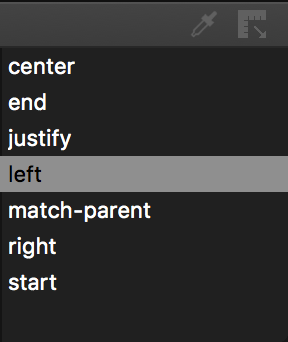
The Keyword List is displayed on the right side of the Palette below the style sheet. This list contains the CSS keywords which are valid when used with the selected declaration. Click on a keyword to insert it.
The current keyword used by the selected declaration, if any, is automatically selected in the keyword list. And like Size Grips, when a CSS property supports layers—multiple value sets delimited by a comma, like background-position—the keyword list will represent the keyword on the layer which contains the caret. For example, given the following declaration:
background-position: top left, bottom left, top right, bottom right;When the caret is positioned within top left the keyword list will represent the first layer; when positioned between bottom left it will adjust the second layer, and so on.
The Warnings list is a real-time summary of the CSS which does not validate in the file you are editing. Open the Warnings list by clicking the Warnings tab button below the style sheet. Click on a warning to identify the line which contains the error, or double-click to select and edit it.
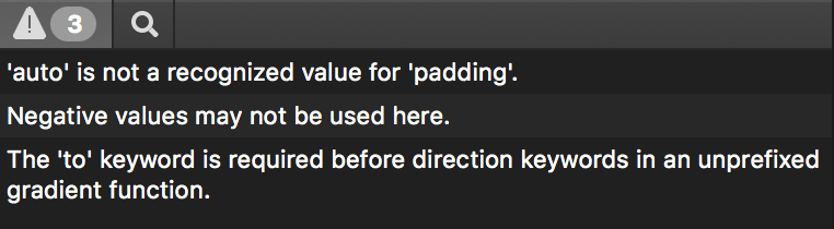
Some browsers support non-standard extensions to CSS through the use of vendor-prefixed properties, rules, and pseudo-functions. These extensions are not standardized and subject to change from one browser version to the next, so they are bypassed by Stylizer.
Stylizer also bypasses all unrecognized CSS @-rules, even those which are not prefixed. For example, you are free to type the following into the code grid:
@banana {
	 ripeness: green;
}
This is not valid CSS and will certainly do nothing, but no warnings will be reported by Stylizer. This design decision allows you to experiment with non-standard extensions without waiting for Stylizer to support them.
Two notable exceptions are the vendor-prefixed versions of @keyframes rules, such as @-webkit-keyframes, and the prefixed versions of linear-gradient() and radial-gradient() functions. Incorrect use of these extensions is reported by Stylizer because they are very commonly used as fallbacks—plus the non-prefixed versions have already become standardized, so there is little chance that the prefixed syntax will change.
To search the textual content of a style sheet, open the search panel by clicking the Search tab button below the style sheet, or by pressing Ctrl+F (⌘F on Mac). Search terms are case-sensitive.
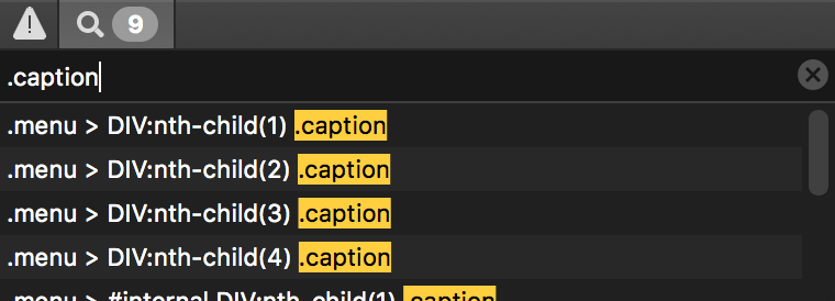
The search results are displayed in the list below the input field. Use the up and down arrow keys to immediately navigate the results list. The style sheet will scroll each match into view automatically. Press Enter to jump to the style sheet and select the match. You may also click a search result to scroll it into view, or double-click a result to jump to the style sheet and select the match (the same behavior as the Enter key).
The search results list is updated in real-time as your edit your style sheet. To clear the results list, click the X on the right side of the search input field, or simply press Escape while the search input field is focused.
Back to top